Your product doesn’t compete with other apps. It competes with distraction.
In today’s world, users have three things in common: limited time, infinite distractions, and a low tolerance for friction. If your product doesn’t deliver clarity and value in seconds, it won’t survive.
This shift is especially painful for product owners and entrepreneurs. You’ve poured effort into features, branding, and backend logic only to find users bouncing off your onboarding or hitting friction and disappearing forever.
So let’s be brutally honest: here are the biggest pain points of killing products in the age of shrinking attention spans and the design tactics to fight back.
The Pain Points (Why You’re Losing Users)
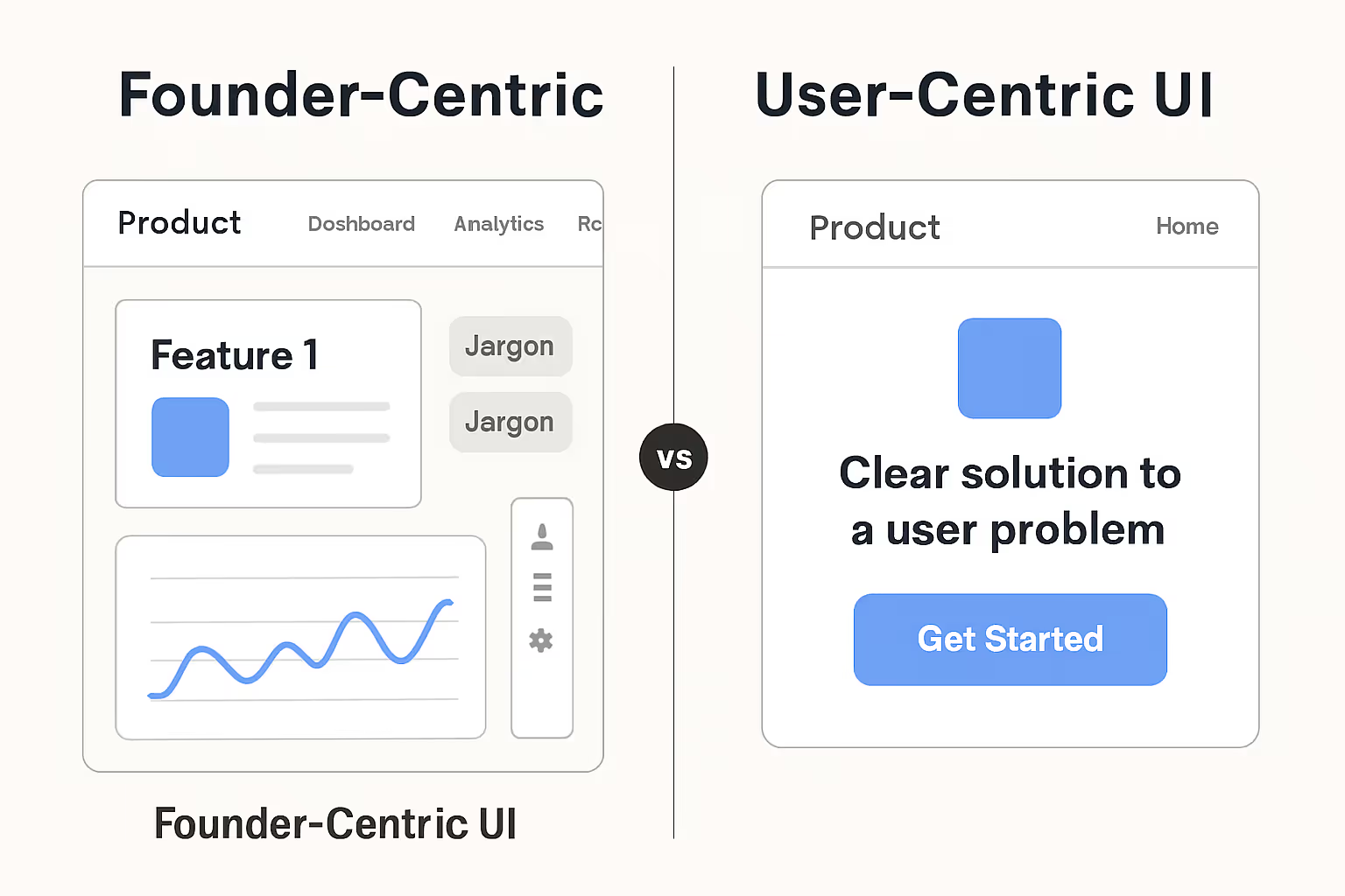
1. You’re building too much, too soon
Adding “all the features users might need” isn’t helping it’s overwhelming. New users don’t want depth; they want clarity.
2. You’re asking for commitment before proving value
Sign-ups, forms, permissions if you’re asking users to work before you show them why, they’ll bounce.
3. Your onboarding is bloated
Popups, walkthroughs, tutorials… instead of helping, they feel like homework. Users don’t want lessons; they want results.
4. Your flows demand too much thinking
Every extra tap, confusing label, or unclear step increases cognitive load. That’s the fast lane to frustration.
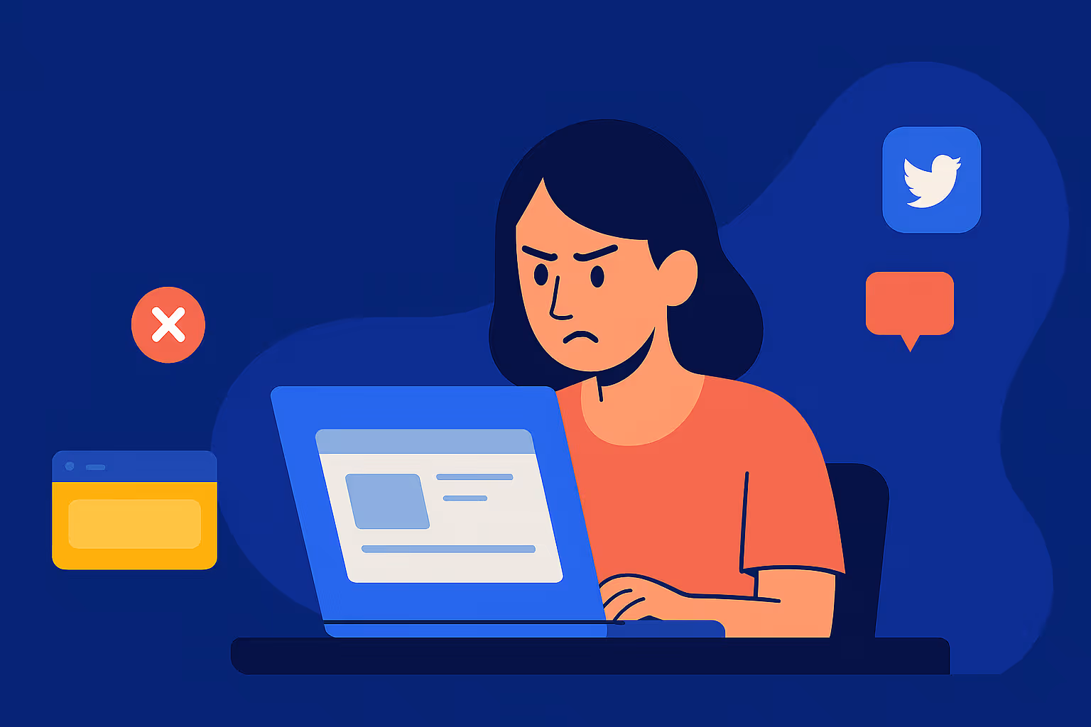
5. You leave users guessing
Slow responses, no status indicators, vague errors, silence kills trust faster than bugs do.
The Fix (What Actually Works)
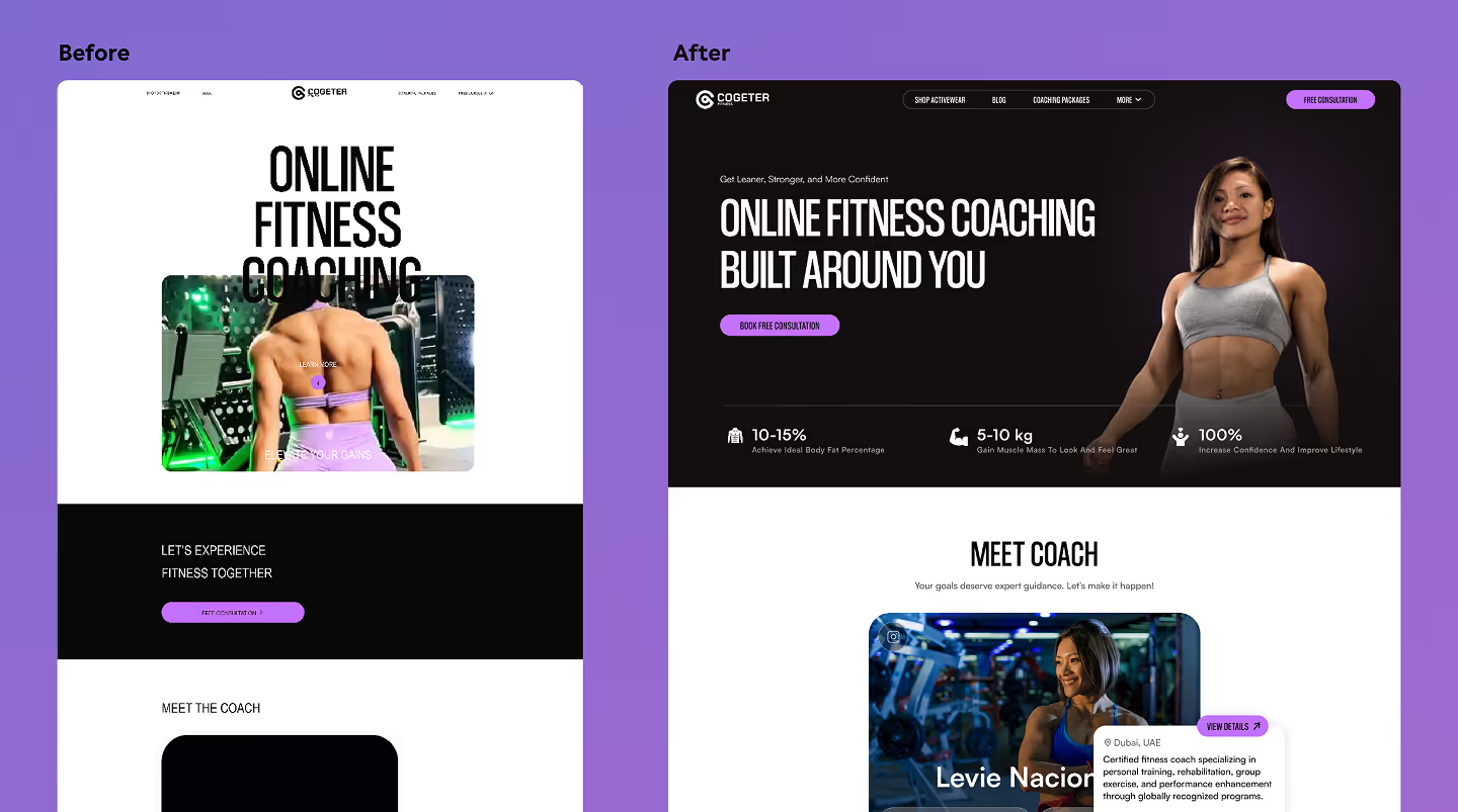
1. Lead with value, cut the fluff
Get users to a “win moment” in 10 seconds or less. Whether that’s generating a first report, previewing their dashboard, or sending a test message show results immediately. Features can wait.
2. Progressive disclosure beats feature dumping
Keep it simple upfront. Reveal complexity only when the user needs it. That way, the interface feels lightweight, not intimidating.
3. Onboarding should feel invisible
Replace bloated tours with bite-sized nudges. Let users learn by doing, not reading.
4. Design for micro-decisions
Every click is a chance to lose someone. Reduce form fields, shorten paths, and remove non-essential steps. Ruthlessly.
5. Feedback is your lifeline
“Loading…” → “Done.”
“Error.” → “Retry.”
Tiny micro-interactions like these build trust and keep users moving forward.
6. Think in “5-second tests”
Show your screen to a stranger for five seconds. If they can’t tell what your product does, you’re losing conversions.

Why This Matters to You as a Founder
Here’s the truth:
- Retention is the new growth. A flashy launch means nothing if people leave after day one.
- Attention is expensive. You’ve paid for every click with ad spend, PR, or sweat equity. Losing users to poor UX is burning money.
- UX = trust. Users don’t forgive confusion. They don’t “come back later.” They move on to a competitor who feels easier.
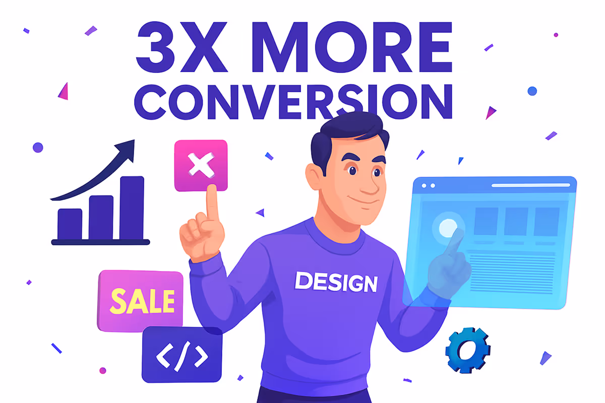
Great UX doesn’t just make your product nicer to use. It protects your marketing budget, increases conversions, and shortens the path to revenue.
In today’s digital world, you don’t have minutes to win users over, you have seconds. If someone can’t understand, act, and see value in under 10 seconds, they’ll be gone. That’s the rule now.
The good news? Short attention spans aren’t your enemy, they're your filter. They force clarity. They demand simplicity. And if your product passes that test, you’ve built something that not only grabs attention but earns trust and loyalty. That’s how products grow, scale, and last.
If you’re losing users to friction, confusion, or bloated flows, you don’t have to keep guessing why. We help product owners cut through the noise and design experiences that stick from the very first click.