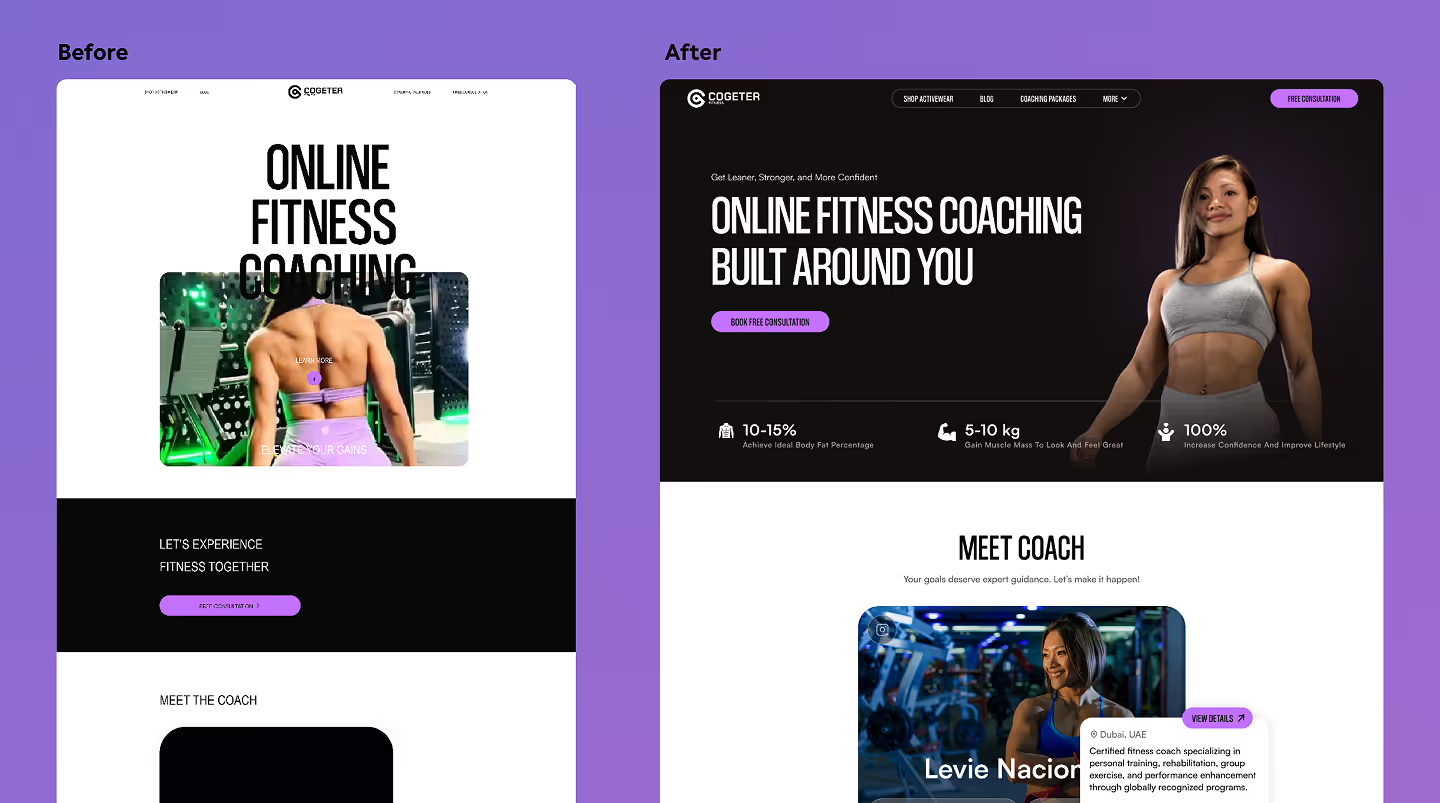
A startup is nearing launch. The idea is solid, the code works, and the go-live date is on the calendar. But a hard truth looms: UX mistakes can silently bury a product before a single real user gives it a chance.
These mistakes aren't always obvious or big. But they break trust, cause confusion, and kill momentum.
Today we will break down 5 deadly UX mistakes commonly seen in early-stage products. These are the issues that often separate the startups that gain traction from those that fizzle out. Here’s how to spot and fix them before launch day.
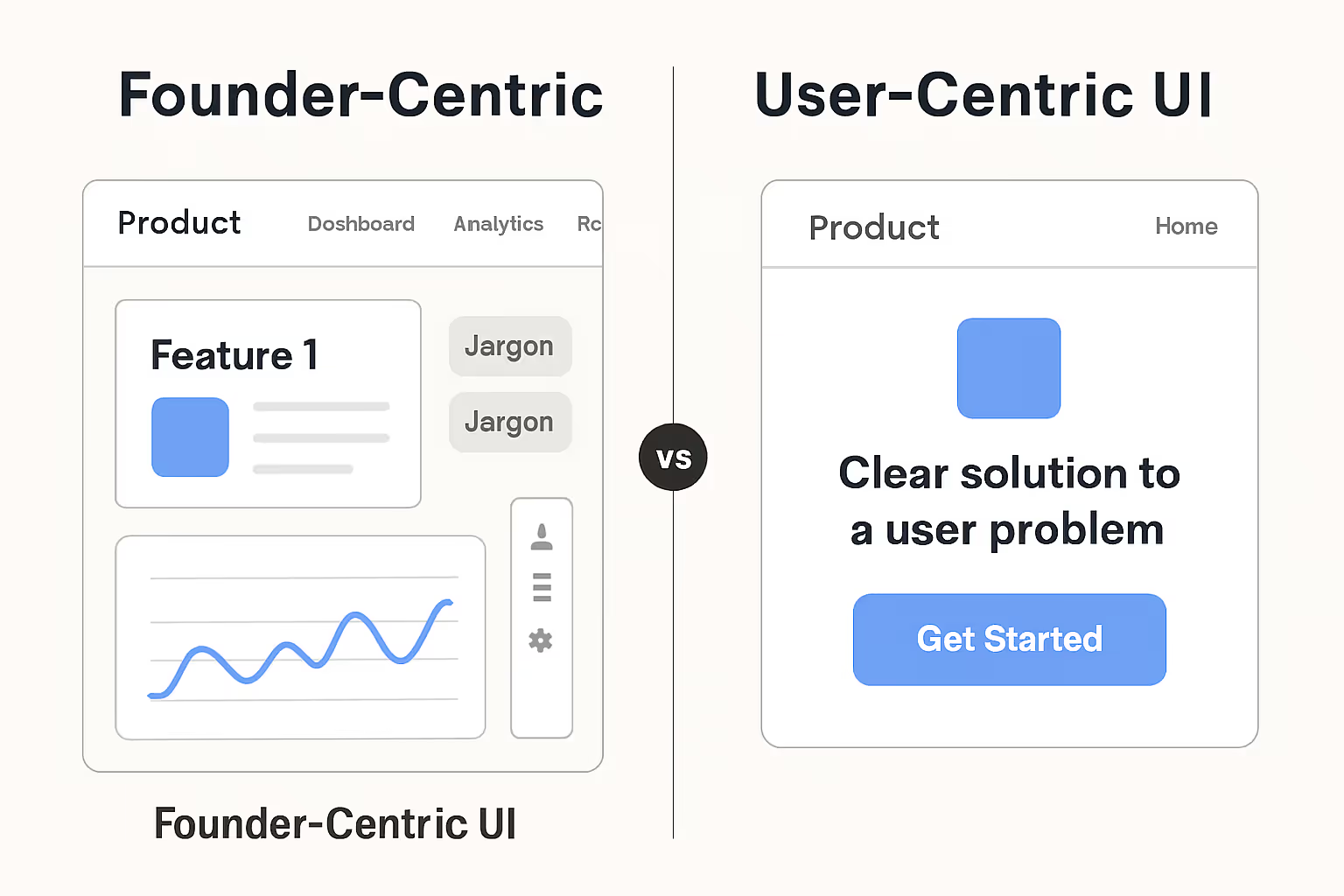
1. Designing for the Team, Not the User
Founders and their teams know their product inside out. They know where to click, what each feature does, and why it matters. But their users don't.
Most early-stage products fall into the trap of being built for the people who created them, not the people who will actually use them.
Common signs:
- Interfaces that are intuitive to the team but leave new users completely lost.
- Features that feel cool on paper but don’t solve a real, urgent pain point for the customer.
- Overuse of technical jargon or internal product language.
Fix it ✅
- Talk to users before designing. Understand their world, their words, and their workflows.
- Test with 3–5 people who’ve never seen the product. If they can't figure it out without help, it's not ready.
- Prioritize clarity over cleverness. Always.
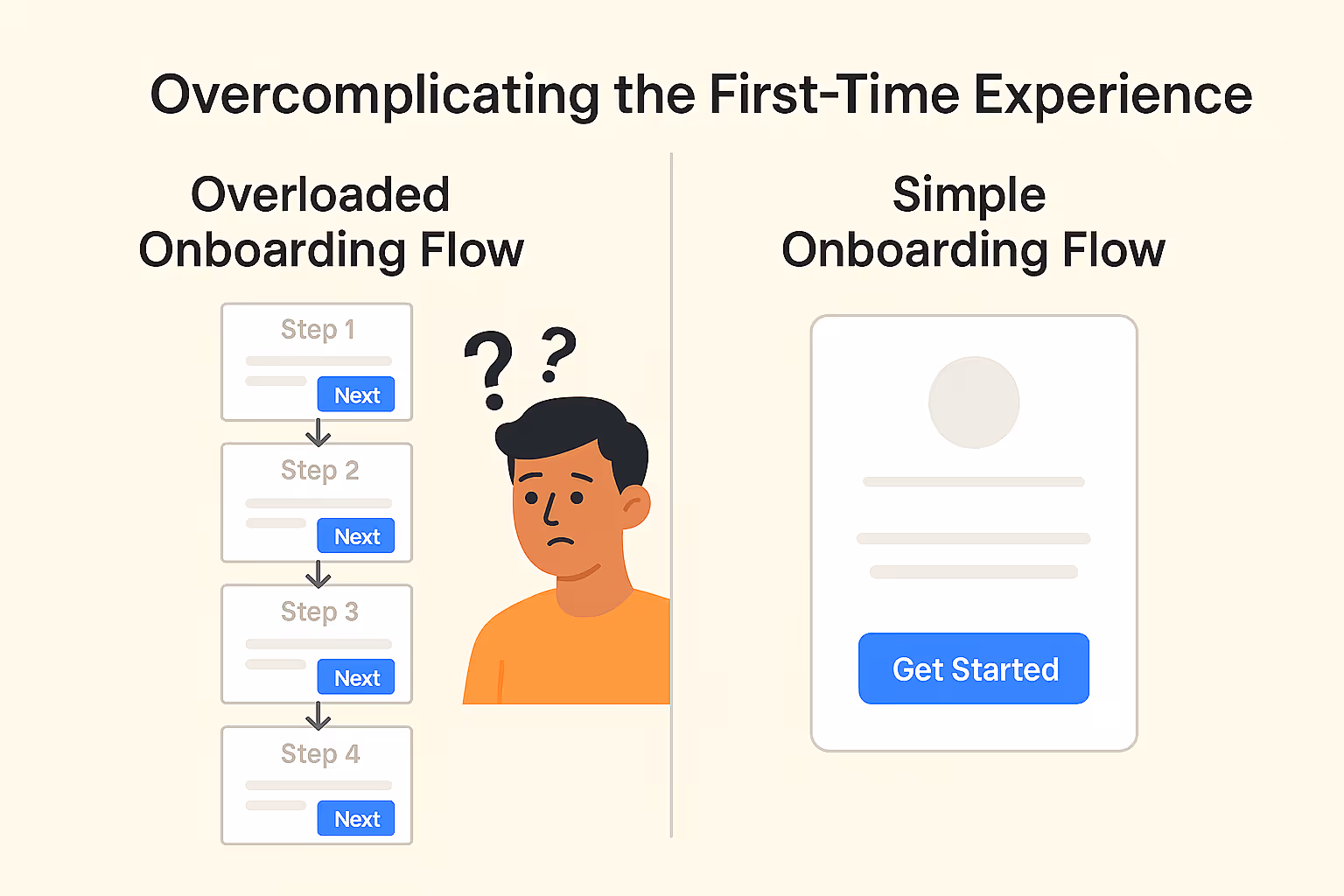
2. Overcomplicating the First-Time Experience
After working hard on features, it's tempting to show them all off at once. But dumping everything on new users right away is like shouting at someone who just walked in the door. Instead of impressing them, it overwhelms them.
What this looks like:
- A 6+ step onboarding process before a user can do anything useful.
- Dashboards packed with features, charts, and buttons from the very first login.
- Endless tooltips or pop-ups fighting for attention.
Fix it ✅
- Focus on one simple 'aha!' moment. The goal for the first session isn't a full product tour; it's to deliver one piece of value that makes the user want to come back.
- Delay complexity. Gradually introduce advanced features as users explore, not all at once.
- Keep onboarding lightweight and skippable. Respect the user's time and let them get straight to the action if they choose.
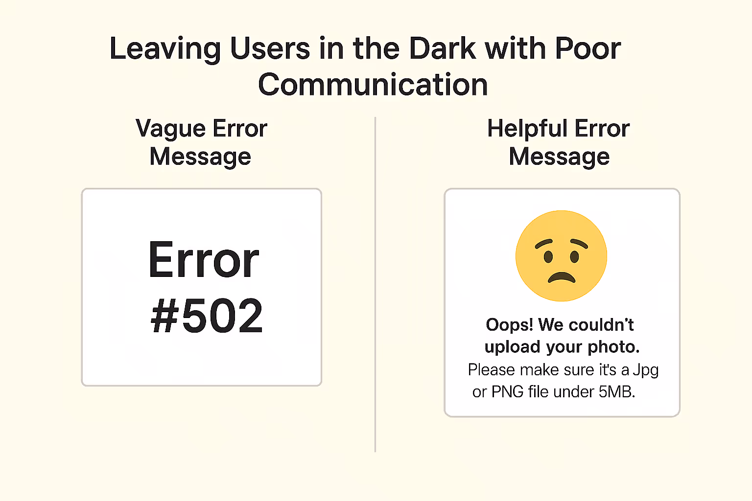
3. Leaving Users in the Dark with Poor Communication
A beautiful design is useless if it doesn't communicate. Without clear microcopy and feedback, users feel like they’re operating in the dark and they’ll blame themselves, not the product.
Common misses:
- Buttons labeled "Submit" instead of action-driven copy like "Create My Project"
- No loading indicators after an action, leaving users wondering if it worked
- Vague error messages like "Oops! Something went wrong"
Fix it ✅
- Use clear, friendly, action-focused microcopy. Every word should guide the user.
- Always show progress, status, or confirmation. A simple spinner or a "Saved!" message builds confidence.
- Treat errors like conversations. Explain what went wrong and guide users toward a solution.
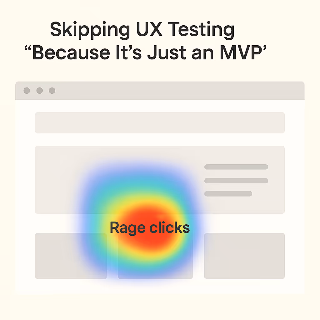
4. Skipping UX Testing “Because It’s Just an MVP”
Perhaps the biggest mistake is the assumption that “we’ll fix UX later.”
Bad UX from the start means users bounce, investors don’t see traction, and the feedback loop is broken. If users can’t complete core tasks, an MVP won’t get any meaningful validation.
The danger signs:
- The product is days from launching without a single non-team member having tested the core flow.
- The product's assumptions haven’t been challenged by real-world behavior.
- Decisions are based on what co-founders think instead of what users actually do.
Fix it ✅
- Test with 3–5 real users. This doesn't need to be a massive research project. A single afternoon and a few 45-minute video calls can uncover 80% of the most critical usability flaws. It's a proven fact that fixing a usability problem during the design phase is 100 times cheaper than fixing it after launch. The 3-5 user test isn't just a suggestion; it's a principle established by the Nielsen Norman Group, which found that this small number can uncover about 85% of usability issues
- Use simple tools. Maze, Hotjar, or even a simple Zoom screen share are more than enough to get started.
- Watch silently & focus on friction. Observe where users get stuck, hesitate, or look confused. Their actions often reveal more than their words.
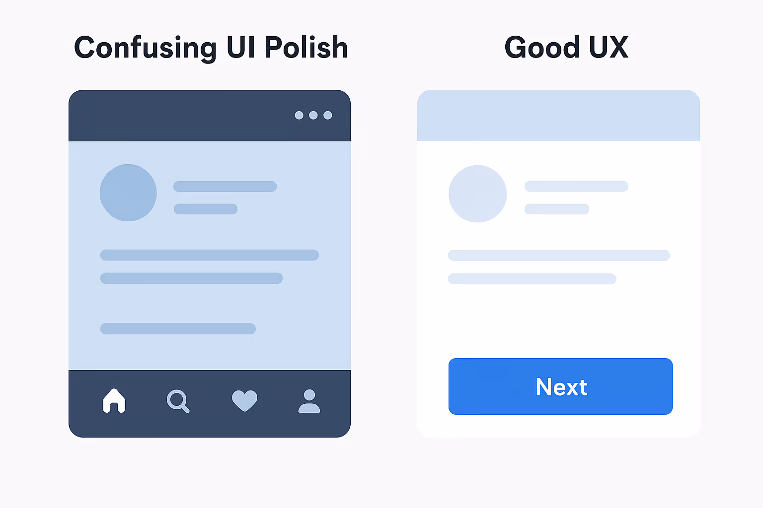
5. Confusing UI Polish with Good UX
Looks matter. But function matters more. Many startups obsess over pixel-perfect visuals, gradients, and animations while ignoring the actual user journey.
This mistake often shows up as:
- Pretty screens with no clear next step or call to action.
- Dribbble-style designs that look stunning but are impractical in a real-world application.
- Inconsistent navigation or confusing UX patterns across the product.
Fix it ✅
- Map the full user journey. Before perfecting pixels, map the entire flow from seeing an ad to achieving success. A simple flowchart on a whiteboard or in a tool like Miro is perfect for this.
- Ask “What’s the goal?” on every screen. Every element should support the user's primary objective for that view.
- Use UI to enhance clarity, not distract from it. Visuals should guide the user, not just look impressive.

The fix is simple in principle: design with users, test early, and ruthlessly simplify. But the execution is hard. Founders are often too close to their own creation to see the friction points that will make a new user give up in seconds. In these cases, an outside perspective isn't a luxury; it's a launch essential.
Launch Day Tip: The 5-Minute Hallway Test
Short on time and resources? Find someone who doesn't work on your product. Ask them to complete one core task on your app without any guidance. Watching them for just five minutes will reveal more about your product's real-world usability than five hours of internal meetings.
Need a professional UX audit before you launch?
We'll walk through your product with fresh eyes, spot the friction points that kill conversions, and give you a no-fluff action plan so you don’t lose the users you should be winning.