Introduction:
Let’s be honest, most websites look great. Sleek fonts. Bold colors. Beautiful images. Maybe even a fancy testimonial slider. But here’s the uncomfortable truth: A pretty website that confuses people will never convert.
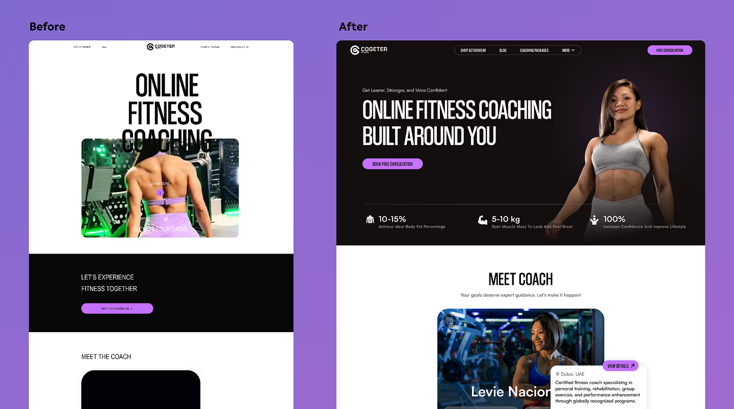
We recently worked with a fitness coach who had everything going for her—social proof, real client results, a compelling offer. Yet most people landed on her page and… disappeared.
We’re talking 5-second exits. A bounce rate so high it looked like the site had a force field. So we asked the golden question:
“What is this page actually telling a stranger to do?” The answer is not much.
Here’s what we found on the site:
- A full-screen video that looked cool… but didn’t say anything
- A “Book Now” button with no context—book what? With who? Why?
- Walls of text explaining benefits, buried in paragraphs no one read
- Client testimonials scattered randomly—no clear story, no transformation arc
It wasn’t bad. It just didn’t guide.Visitors didn’t know what the site was offering, why it mattered, or what to do next. So they left.
We rebuilt the page with one focus:
"What should a new visitor do in the first 5 seconds?"
This clarity-first approach changed everything. Here’s how:
- A headline that actually speaks to users
- Call to Actions that actually mean something, tell user what they’re getting
- Stats and proof moved above the fold
- Visual hierarchy that flows like a story
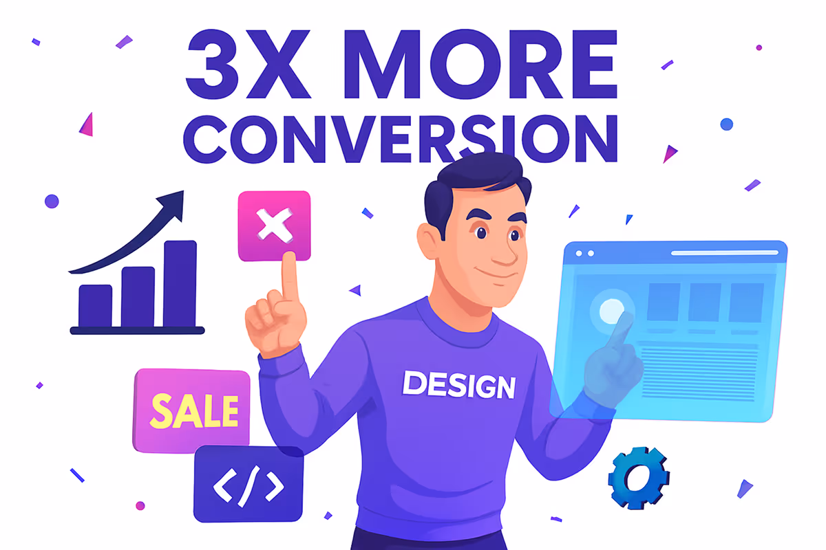
Within 14 days, the bounce rate dropped. The site started 3X more conversion. More people signed up, took the first step, and actually began the journey the brand was built to deliver. The difference? Clear messaging, guided action, and a design that finally worked for real users.
If you want your own site to convert like crazy, here’s the Clarity Check we use on every homepage:
- Can a stranger understand what you do in 3 seconds?
No jargon. No fluff. Just what’s in it for them.
- Is your main CTA visible without scrolling?
Button text matters. So does where you put it.
- Does the entire page guide them toward that action?
Every image, headline, and section should work like a tour guide—not a distraction.
If you fail any of these, you’re probably leaving leads, signups, or money on the table.
People don’t land on your site hoping to admire your color palette. They want answers. They want direction. They want to feel like this was made for me.
And when your design gives them that feeling without making them scroll or think or guess?
That’s when your conversions take off.
Did your site fail the Clarity Check? Don't worry, most do. It's tough to see the 'confusing' parts when you're so close to your own business. That's where a trained, outside perspective becomes invaluable.