Tell Us About Your Project

Union

Submitted Successfully

Your project details are in! Our team is reviewing them, and we’ll get back to you shortly to bring your vision to life!
Oops! Something went wrong while submitting the form.
Logo with stylized lowercase letters 'pe' above the words 'PURE ELEMENTS'.
Let's Connect
arrow-sm-right
Back

Effortless through Design: The Psychology That Makes Products Feel Simple

Illustration of a woman with long brown hair wearing a maroon top, faceless.
Bisma Shakeel
06, November 2025
5 min read
Design Systems
UX Design
UX Psychology
Design Thinking
Blue silhouette of a human head with a brain inside, arrow pointing right, check marks, and an ID card connected by an upward red arrow.

We like to imagine users exploring our products with curiosity and patience. But that’s rarely the case. Most people aren’t looking for an adventure when they land on your platform they’re trying to get something done. Quickly, easily, and with as little effort as possible.

This isn’t a flaw in human behavior; it’s human nature. We’re wired to conserve energy, to take shortcuts, and to choose whatever feels easiest. The truth is, people don’t fall in love with complex products, they fall in love with effortless ones.

And that’s where great design becomes a competitive advantage. The brands that win aren’t necessarily more innovative; they’re more intuitive. They don’t fight human laziness; they design for it.

Friction: The Good Kind That Builds Trust

We often hear that “friction kills conversion.” But that’s only half the story. The right kind of friction can actually protect users, reduce errors, and build trust.

Think about it: a confirmation screen before deleting data prevents irreversible mistakes. A review step before completing a purchase gives people confidence. A warning before closing unsaved work saves frustration later. These moments of micro-friction reassure users that the product is looking out for them.

This is what psychologists call productive friction intentional pauses that slow users down when it matters most. The best experiences don’t remove all obstacles; they place friction deliberately, in the moments where accuracy and trust are more important than speed.

Shortcuts: Reward the Path of Least Resistance

People aren’t lazy by nature, they're efficient. They’ll always seek the fastest route to their goal, and great products are built to support that instinct.

Shortcuts turn repetition into flow. Autofill that remembers user details, “recent actions” that bring them back to familiar steps, or one-click reorders that anticipate intent all of these reduce cognitive effort. They make the product feel intelligent, even empathetic, as if it’s learning from the user instead of demanding their attention.

Illustration of a hand pointing to a blue checklist item with a checkmark, alongside yellow and red buttons and a blue arrow.

Every second saved is a small victory. When you help users get to the outcome faster, they not only stay, they trust you more. Over time, that sense of ease translates directly into loyalty, retention, and word-of-mouth growth.

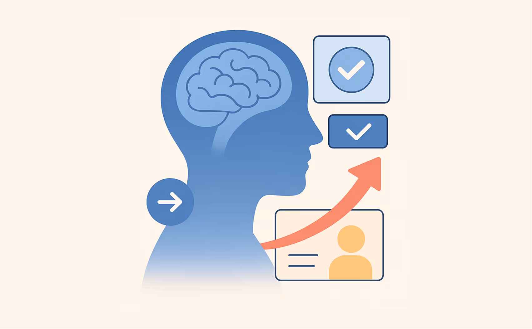
Defaults: Invisible Design, Real Impact

Here’s one of the most powerful but underused design truths: most people never change default settings.

Defaults shape behavior more than prompts, nudges, or tutorials ever could. They silently steer decisions, influence habits, and shape how users experience your product.

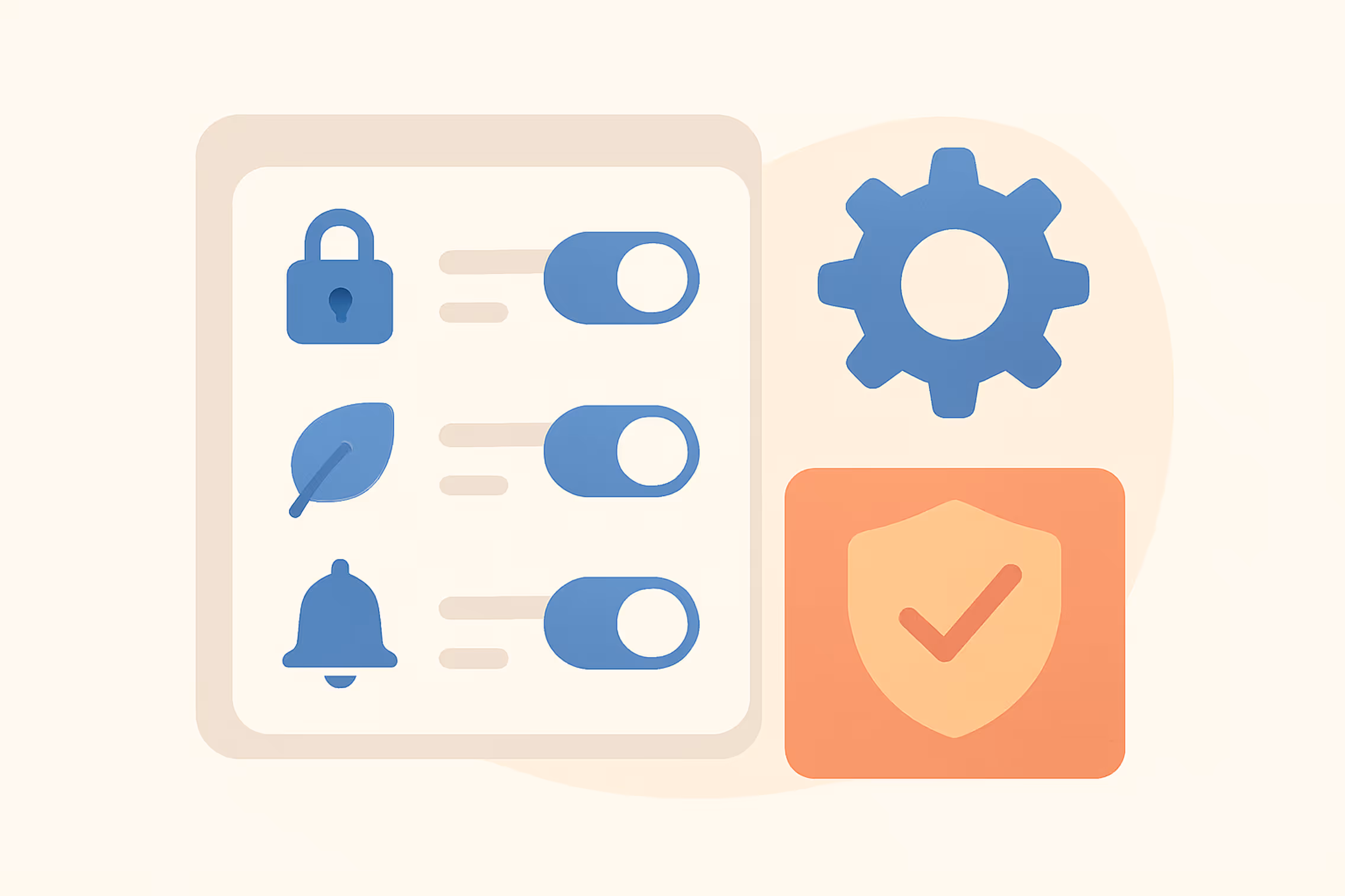
Auto-enabling privacy-friendly settings, preselecting eco-shipping, or turning on helpful notifications by default, these are small decisions with huge behavioral outcomes. The goal isn’t manipulation; it’s alignment. You’re guiding users toward the choices that serve their best interests while maintaining trust.

Illustration of a settings panel with toggle switches next to lock, leaf, and bell icons, beside a gear icon and a shield with a checkmark.

The smartest defaults make good behavior feel automatic. They reduce decision fatigue, simplify complexity, and make the experience feel “just right” without the user having to think about it.

The Psychology Behind It

Designing for laziness is really designing for cognitive ease the state where the brain feels comfortable because things make sense. Every click, scroll, and decision carries a mental cost. When those costs add up, users feel tired and confused. When they’re minimized, everything feels intuitive.

Cognitive ease creates confidence. When people can move through your product without hesitation, they feel capable. They start associating that feeling of competence with your brand. The product fades into the background and what remains is a sense of trust and satisfaction.

The Business Impact

Designing for laziness isn’t just about usability, it's about growth. Every unnecessary step, unclear label, or cognitive hurdle can cost you users, conversions, or revenue. Simplifying those touchpoints directly impacts the bottom line.

When users find it easy to navigate, decide, and act, they move faster through the funnel. They buy sooner, abandon less, and engage more. A frictionless experience doesn’t just delight users, it compounds business efficiency.

In short, designing for effortlessness doesn’t just improve UX metrics. It builds retention, reduces support load, and turns human behavior into a growth engine.

Takeaway

People rarely choose the “best” product. They choose the one that feels easiest to use.

So don’t design for the ideal, patient, highly attentive user. Design for the tired, distracted, shortcut-taking human, the one who wants results without effort.

When you make the lazy choice the right one, you don’t just make your product simpler. You make it feel inevitable.

Because the most powerful UX isn’t the one users notice, it's the one that feels like it was built exactly for how their mind already works.

bulb
Turn Your Product Into an Effortless Experience
Union
Book Free Consultation 

Recommended Posts

Union
View All Posts
Woman in a white sweater sitting at a cafe table near a window, looking at her smartphone with a cup of coffee and a pastry in front of her.
Beyond Pretty Pixels: Our 7-Step Checklist for a Lightning-Fast Webflow Site That Google Loves
You’ve invested in a stunning, pixel-perfect Webflow website. It looks incredible, the branding is on point, and the animations are slick.
Illustration of a frustrated woman working on a laptop with UX error icons around and a man presenting UI design concepts.
Avoid These 5 UX Mistakes That Sink Startup Products
A startup is nearing launch. The idea is solid, the code works, and the go-live date is on the calendar. But a hard truth looms: UX mistakes can silently bury a product before a single real user gives it a chance.
Illustration of a man in a purple shirt labeled 'DESIGN' interacting with icons including a growth chart, sale tag, code symbol, and a website interface, with the text '3X MORE CONVERSION' above.
Your Website Isn’t Converting? Here’s the Fix That Got a Fitness Brand 3X More Conversion
Let’s be honest, most websites look great. Sleek fonts. Bold colors. Beautiful images. Maybe even a fancy testimonial slider. But here’s the uncomfortable truth: A pretty website that...
Woman in a white sweater sitting at a cafe table near a window, looking at her smartphone with a cup of coffee and a pastry in front of her.
Beyond Pretty Pixels: Our 7-Step Checklist for a Lightning-Fast Webflow Site That Google Loves
How artificial intelligence is redefining job roles and enhancing productivity
Boost Your Site Speed
Read More Arrow
Illustration of a frustrated woman working on a laptop with UX error icons around and a man presenting UI design concepts.
Avoid These 5 UX Mistakes That Sink Startup Products
How artificial intelligence is redefining job roles and enhancing productivity
Avoid the Mistakes
Read More Arrow
Illustration of a man in a purple shirt labeled 'DESIGN' interacting with icons including a growth chart, sale tag, code symbol, and a website interface, with the text '3X MORE CONVERSION' above.
Your Website Isn’t Converting? Here’s the Fix That Got a Fitness Brand 3X More Conversion
How artificial intelligence is redefining job roles and enhancing productivity
See How They Did It
Read More Arrow
Let's Talk
bulb
Idea Validator
العربية
bulb
Validate Your Tech Idea: Get Your Instant Readiness Report!
Answer a few questions to get a personalized report on your idea’s market fit, feasibility, and business model.
are-to-improve
Evaluate your idea's market fit
improve
Assess technical feasibility
plus-icon
Identify strengths & weaknesses
Union
Start Validation for Free
timer
Approx. 7-10 mins
33%
Question 1/17
Simplify Question
Problem and Market Validation
How clearly have you defined the core problem your idea solves for your target audience?
Not at all clear, still vague
1
2
3
4
5
1 = Not important
5 = Essential
33%
Question 1/17
Simplify Question
Problem and Market Validation
How clearly have you defined the core problem your idea solves for your target audience?
Not at all clear, still vague
1
2
3
4
5
1 = Not important
5 = Essential
loading-circle

Analyzing Your Vision

We are processing your responses to create a comprehensive analysis

Your Idea Validation Report

Your idea validation score 🎯

64/85

Strong Potential

Icon
bulb
Your idea shows  promising market fit with room for strategic improvements
Services Icons

Performance Breakdown by Pillar

Problem & Market Validation
magnifying-glass-bold
Area to Improve
10/20
Your foundation on problem understanding and market fit needs strengthening. Conduct at least 15-20 in-depth qualitative interviews with users.
Solution & Product Design
star
Good Potential
10/20
Your solution concept is good, but ensure your MVP is truly minimal and directly addresses the core problem. Refine user flows
Technical Feasibility
rocket
Strength
10/20
Excellent! You have a clear vision for building your product and the necessary skills. Consider creating a technical roadmap for your MVP.
Business Model & Monetization
magnifying-glass-bold
Area to Improve
10/20
Your revenue model is somewhat defined, but more research on pricing and willingness to pay is needed. Explore different models in industry.
Go-to-Market & Operations
star
Good Potential
10/20
Your go-to-market strategy needs significant development. Define how you will acquire your first customers and identify clear distribution channels.
Team & Resources
rocket
Strength
10/20
Excellent! You have a clear vision for building your product and the necessary skills. Consider creating a technical roadmap for your MVP.
Where to Go From Here
growth

Make Progress with These Steps

Your idea has strong merits, but there are clear opportunities for refinement. Prioritize addressing the identified "Areas for Growth" and conduct further validation in those specific domains. A focused approach will significantly enhance your chances of success
Services Icons2

Your Idea's Key Takeaways

Top Strengths
tick
Strong market need validation
tick
Clear revenue model
tick
Competitive advantage identified
Areas for Growth
search
Technical implementation plan
search
User acquisition strategy
search
Risk mitigation planning
Smart, Stunning, Strategic 🎯

Your Idea Deserves the Right Execution Plan

Vector
calendar
Book a Free Consultation
Vector
book
Explore Resources
glass
cross
Link Copied